Sade Ekulona
Learning Experience Designer
VHA UX Training Website
Tools: Miro, Figma, Microsoft Excel
Role: Researcher, Data Analyst, Designer, Information Architect
Purpose
The Veteran's Health Administration needs to teach UX to its employees.
The Veteran's Health Administration (VHA) wants to advance the adoption of good Human-Centered Design by teaching UX to its Clinical Application Coordinators (CACs), with various levels of UX experience. Our client, a representative from the VHA, wanted help organizing and designing a website to achieve their goal, so we were given access to a Github Repository of about 500 files.
Process
Stakeholder Interviews & Content Inventory
Competitor Analysis
& Information Architecture
Personas
Card Sort
Wireframes
Rollout
Suggestions
Stakeholder Interviews
After conducting stakeholder interviews we had a clear understanding of the client's goals:
Outline material in a way that would be easily accessible and digestible for learners with various levels of UX experience.
Provide design iterations for a UX-focused educational site for CACs (and other VHA employees).
Provide a strategy for our client in order to get content out as soon as possible.
Ensure that the site meets accessibility requirements.
Content Inventory
We sifted through the repository and categorized files as 'Reference Material', 'Guides', 'Research', & 'Internal Documents', then selected only the content that was relevant to the project's goals.

Competitor Analysis
We took a look at Nielsen Norman Group, usability.gov, UX Engineer, & UX Planet to see what they offered users and get an idea of how to organize content.

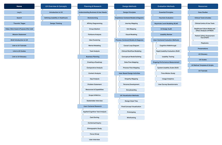
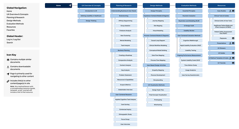
Information Architecture
We created two sitemaps, the first draft was based on the content inventory and the research gathered from competitors. The second draft was created after we had more research, feedback, and information from our client.

Personas
Again, the goal of the VHA is to teach UX to Clinical Application Coordinators with various levels of UX experience and exposure; based on this, we created personas.

Primary Persona

Describe your image

Persona William
Primary Persona
Card Sort
We conducted a moderated card sort over zoom on the Miro platform. Our participants' UX experience levels varied from no exposure at all to 10+ years in the field.
-
Setup included sortable cards on the left and category buckets on the right.
-
Notes were provided on many cards to help our less experienced participants with definitions.
-
The star icons allowed participants to select categories that they would like quick access to from the Homepage.

Based on the quantitative and qualitative feedback we received from our participants, we realized that there was confusion with categories. So, we made changes to the site map.
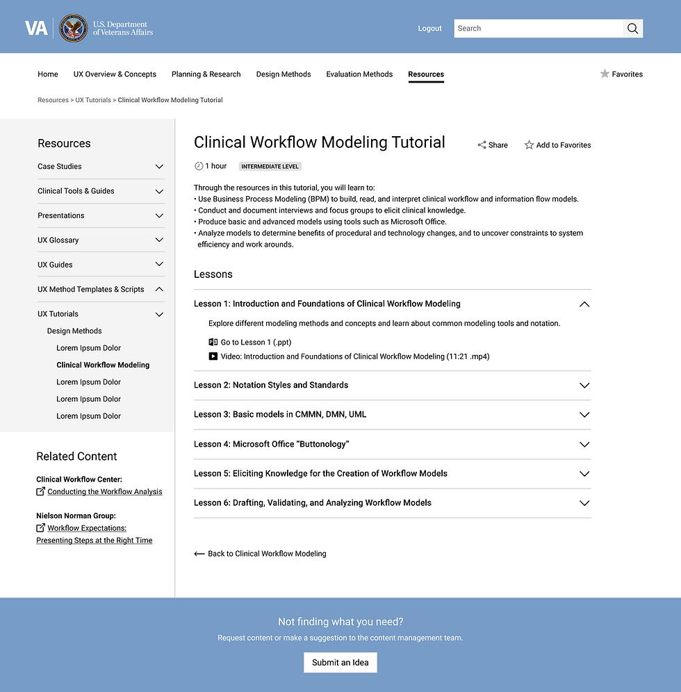
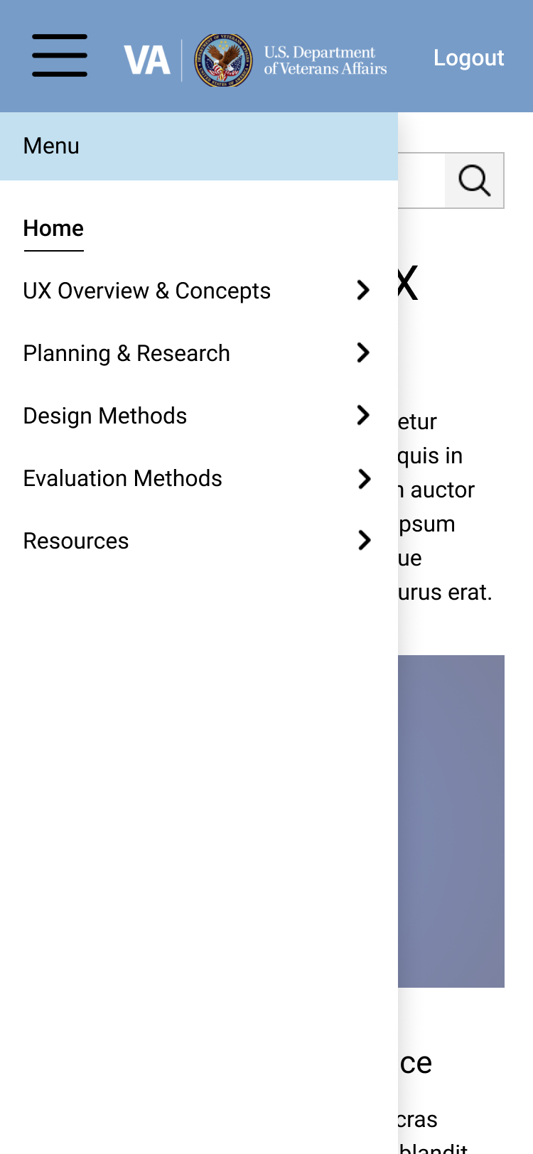
Wireframes
There were several wireframes in the Github repository that we used as a reference when designing our wireframes. Based on those wireframes, we got an idea of where our client wanted to go, minimalism was key. Here are a few of the designs that we suggested for computers and mobile.
Desktop


Mobile


Accessibility Features
Along with adding blue lines for accessibility purposes, we suggested that the VHA include read times for articles and closed captioning for any videos that would be available for users.


Rollout
We suggested a 3 Phase Rollout that would allow Clinical Application Coordinators to begin learning as soon as possible.
